Come grab your paper, embellishments and template to make this snazzy origami Fathers Day Card.
Customize to the Dad in your life with patterned paper, brads, button, stamps, glitter...Whatever!!
Have a Dad in a uniform? Policeman-Navy Blue Paper Fireman-Fire Station Red, or bright Yellow Paper Mailman- Pebble Grey Paper
Dad in the Armed Services? Army- Olive Green or Beige Paper Navy- Navy Blue Marines-Navy Blue or Beige Paper Air Force- Pebble Grey You could even make your own Camouflage pattern!!!
Description: Looking for the personal touch to add to your wedding invitations or thank you cards? Perhaps you needs a personalized gift for a hostess, bridesmaid, or someone else in your life? In this class Monica will teach you simple techniques for creating your own rubber stamps (from your own designs or templates provided in class). Monica will also share with you tips for turning these rubber stamps into complete gift sets – the gift that keeps on giving long after the occasion has passed.
Above is a set of Save The Date Cards announcing the couple (Sara and Chad) are "getting hitched." The theme is country western, so the initials of the bride and groom were carved into a circle that looks like a branding iron.
The stamp was used to embellish the cover of the Invitations, and for hand stamping the Thank you cards.
The rubber stamp will continue to work hard after the wedding too, for personalizing letterhead and Holiday cards.
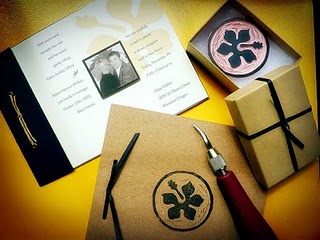
Below is an invitation set designed for a couple getting married in Hawaii.
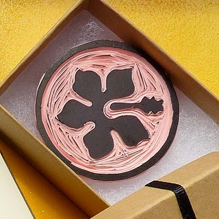
The Hibiscus flower was the graphic element used throughout all of the pieces.
The Hibiscus flower stamp for use on the guest book then boxed and given to the couple.
It's the perfect gift that will keep on giving and remind the couple of their special day for many years to come.
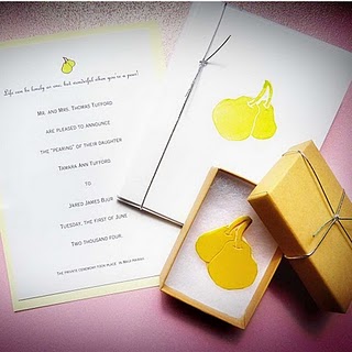
Below is a wedding invitation with Pears as the theme.
Several sets of matching note cards were created from one carved rubber stamp.
The note cards were then given to the bridesmaids and hostesses as lovely hand made gifts from the bride.
Skill Level: Beginner/Intermediate, ages 15 and up
New product has arrived in our stores, clear tin pails in four sizes! This new addition gives way to many creative ideas, great for all-occasion gifts, party favors, wedding favors, or just because, who doesn't love a blank canvas such as this?
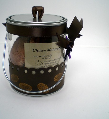
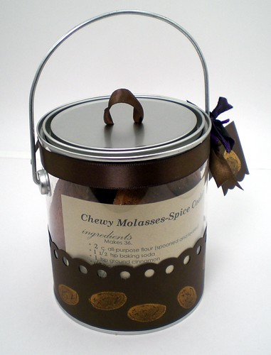
Our ever so clever staff member Rachel grabbed one as soon as they arrived and got to brainstorming. She made this homemade cookie tin & recipe card. She even carved the mini cookie stamp!
How do you get the ribbon pull top? The tin top is fairy malleable and making a hole can be done in various ways.
Idea #1- Use a wide nail and hammer to create an indent. Idea #2- The 6" indented Crop 'o' Dile eyelet setter can punch though thin metal such as this creating a clean hole.
Once your hole is made, simply slip about 6" of ribbon through and knot on the inside & trim any excess tails.
Ingredients: medium clear tin pail Morex bronze ribbon in 7/8" Various metallic paper (pictured Stardream Bronze & Curious Metallics Gold Leaf) Your favorite sweet cookie recipe! Find the Chewy Molasses-Spice Cookies seen here from Martha Stewart!
What clever things could you make with these tin pails?!
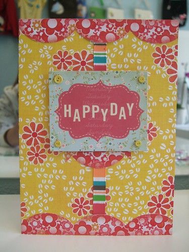
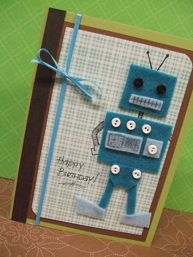
We are so lucky to have such a talented lady on staff bringing us her whimsical & colorful creations! She is the owner.artist behind Nimbi Designs, a world of all things paper. A graphic designer turned craftista at heart, she is bringing her eye for layout, design sense, & composition to cards, invitations, and even a little felt.
Don't miss her All Things Cards Class this weekend! Saturday in our store from 4-6 pm. She will be teaching basic how-to's for the cards seen her as well as cutting, gluing, and embellishment use technique.
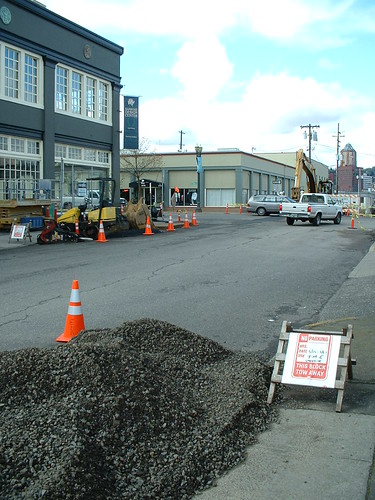
You might have heard about the construction on Grand Avenue for the new street car access being installed. In fact, if you've tried to drive by the store lately, there is absolutely no way you could have not noticed.
Here's some pictures of what it looks like on the street:
We are very much open during all the construction going on, hoping to help you with all your paper (& beyond!) needs. And even with the street parking currently occupied, we're very lucky to have off street parking right out front!
If looking for alternative routes to get here, might we suggest coming down SE 7th Avenue, and turning on SE Salmon to reach our parking lot at the corner of SE Salmon & SE Grand:
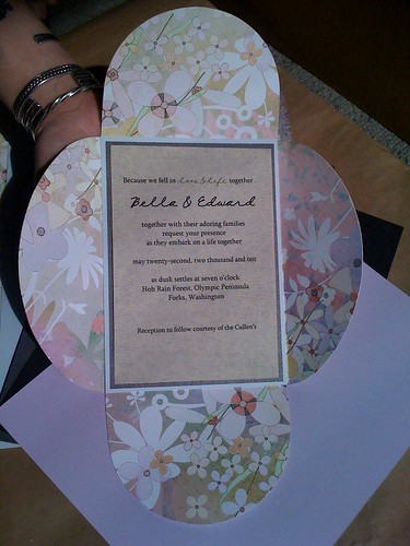
Inspired by Rachel's post below and the recent Bravo Wedding event, I wanted to take a room or a table setting and turn it into an invitation. Although I found much inspiration browsing through the wedding pages of Martha Stewart Weddings, the Birds & Blossoms table was my favorite! Simple and sweet, it radiated both late spring and early summer weddings. Below is the result!
Using paper from one of the newest lines from Basic Grey: Kioshi I found hues of mauve, lavender, and sweet yellow that is seen in the forefront of the table setting. The petal card is cut out from our in house die cut machine.
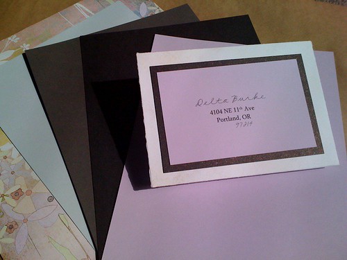
I then layered a powder blue, deep metallic slate, and a cream to pull out the color in the wine glasses to compliment the softness of the whole table.
The best part about the petal cards? They fold up so the backside may be used to address each one, making each a little more personal.
Birds & Blossoms ingredients + Cost
Invite: Basic Grey Kioshi: Anason Curious Metallics: Shadow Classic Crest: Windsor Blue Eames Architecture: Natural White
All papers photographed may be found in any Paper Zone store. Want to see this invite in person? Stop by our Portland location for this and many other ideas!
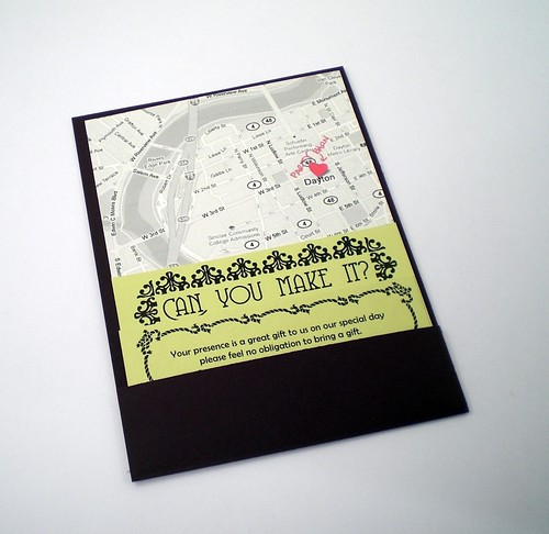
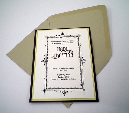
Wanting to translate a fashion icon and look I loved into a wedding invite, I started pulling samples of any of our Paper Zone stock that came close to matching the purple, teal, citrine and fuchsia from my inspiration outfit. I originally thought I would use Violette, our new sparkly purple from Curious Metallics. Once I started playing with the combination, I liked the way the Lime (another new Curious Metallics color) and Poison Ivory (a Curious Iridescents paper) coordinated. I set aside the Violette and decided on Domtar Feltweave in Eggplant. The texture of the paper reminded me of the ruffles on the dress and the darker purple let the Lime metallic really pop.
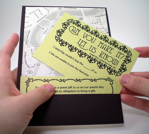
I never found a good fuchsia paper, instead I used a bright sticker and a sparkly fuchsia gel pen to mark the location of the ceremony on the black and white printed map.
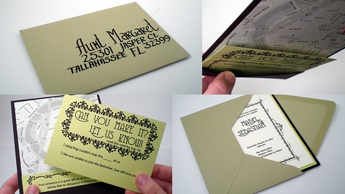
I like the clean lines of this style of diy wedding invitation. My coworker Paola originally introduced me to it in a smaller A6 Size hint: Know your envelope sizes! Design your invite approx. 1/4" smaller than the size of your envelope. Paper Zone's broadest options will be in sizes A2, A6 and A7. Slightly larger A7+ and A9 sizes are also available in a number of options. Knowing the dimensions of your envelope choices before you start designing your perfect invitation will circumvent all sorts of frustration. I like this slightly larger size because it gives more room for the enclosures to fit in the surprise back pocket!
Inspiration to get you started on making your DIY invitations is all around you! Memorabilia from a previous vacation with your sweetie, longtime favorite colors or themes, the location for the wedding, the season of your event, all these can lend their color palettes to your invite. It's important the invitation speaks to your style and the event to come. Guests use the invite to clue them into the formality and feel of the wedding to come.
For myself, walking around my neighborhood I try to memorize the color schemes of the houses along the way, I notice the contrast of bright grasses and soft petals of the blooming trees. Browsing the blogs I regularly read, I catch myself admiring the way the yellows in that banana fricasse would make a great invite, and perusing a discarded magazine I tear out the page with a fantastic red carpet ensemble. The rich purple of the cocktail dress is punched up by little pops of other jewel tones: a citrine clutch, fuchsia pumps and a teal belt. I like the balance of youthful energy with clean lines, a fun and classy outfit.
To translate this into an invite I knew I would have to be flexible in my color palette. There are just too many colors in the world for paper to match them all! It was the overall feel and the way the colors played with each other that I was really drawn to. hint: if you can't find the perfect color of paper for your invite remember there are loads of ways to include it through embellishments like rubber stamping, ribbon, brads or printing in color.
If you want to learn how to make this invitation, check back (or better yet, join our other followers) for a future post with detailed instructions to construct this fashion inspired invitation.
From the Portland Paper Zone,
Rachel db.
All paper and crafting items used to make this invitation can be found at your local Paper Zone. For informational purposes only, not to be viewed as endorsements: designed using Adobe InDesign with fonts from Dafont.com and clip art from Old Fashioned Frames clip art and cd-rom book from Dover Publications. Printed on a Canon MP620 home ink-jet printer. Rachel is a part-time associate at the Portland Paper Zone. In addition to helping the crafty masses find the perfect product for their project, she can be found sprucing up the worker-owned A Better Cycleand managing her small business BikeCozy.













 Posts
Posts

