


Wanting to translate a fashion icon and look I loved into a wedding invite, I started pulling samples of any of our Paper Zone stock that came close to matching the purple, teal, citrine and fuchsia from my inspiration outfit. I originally thought I would use Violette, our new sparkly purple from Curious Metallics. Once I started playing with the combination, I liked the way the Lime (another new Curious Metallics color) and Poison Ivory (a Curious Iridescents paper) coordinated. I set aside the Violette and decided on Domtar Feltweave in Eggplant. The texture of the paper reminded me of the ruffles on the dress and the darker purple let the Lime metallic really pop.
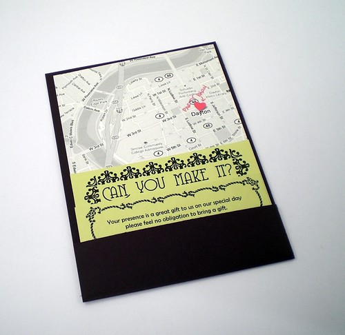 I never found a good fuchsia paper, instead I used a bright sticker and a sparkly fuchsia gel pen to mark the location of the ceremony on the black and white printed map.
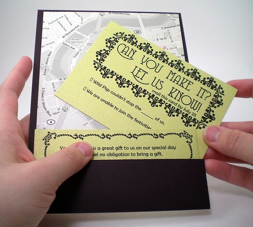
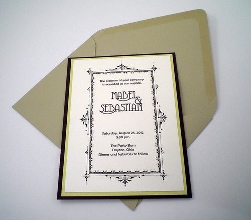 I like the clean lines of this style of diy wedding invitation. My coworker Paola originally introduced me to it in a smaller A6 Size hint: Know your envelope sizes! Design your invite approx. 1/4" smaller than the size of your envelope. Paper Zone's broadest options will be in sizes A2, A6 and A7. Slightly larger A7+ and A9 sizes are also available in a number of options. Knowing the dimensions of your envelope choices before you start designing your perfect invitation will circumvent all sorts of frustration. I like this slightly larger size because it gives more room for the enclosures to fit in the surprise back pocket!
Inspiration to get you started on making your DIY invitations is all around you! Memorabilia from a previous vacation with your sweetie, longtime favorite colors or themes, the location for the wedding, the season of your event, all these can lend their color palettes to your invite. It's important the invitation speaks to your style and the event to come. Guests use the invite to clue them into the formality and feel of the wedding to come.
For myself, walking around my neighborhood I try to memorize the color schemes of the houses along the way, I notice the contrast of bright grasses and soft petals of the blooming trees. Browsing the blogs I regularly read, I catch myself admiring the way the yellows in that banana fricasse would make a great invite, and perusing a discarded magazine I tear out the page with a fantastic red carpet ensemble. The rich purple of the cocktail dress is punched up by little pops of other jewel tones: a citrine clutch, fuchsia pumps and a teal belt. I like the balance of youthful energy with clean lines, a fun and classy outfit.
To translate this into an invite I knew I would have to be flexible in my color palette. There are just too many colors in the world for paper to match them all! It was the overall feel and the way the colors played with each other that I was really drawn to. hint: if you can't find the perfect color of paper for your invite remember there are loads of ways to include it through embellishments like rubber stamping, ribbon, brads or printing in color.
If you want to learn how to make this invitation, check back (or better yet, join our other followers) for a future post with detailed instructions to construct this fashion inspired invitation.
From the Portland Paper Zone,
Rachel db.
All paper and crafting items used to make this invitation can be found at your local Paper Zone. For informational purposes only, not to be viewed as endorsements: designed using Adobe InDesign with fonts from Dafont.com and clip art from Old Fashioned Frames clip art and cd-rom book from Dover Publications. Printed on a Canon MP620 home ink-jet printer.
Rachel is a part-time associate at the Portland Paper Zone. In addition to helping the crafty masses find the perfect product for their project, she can be found sprucing up the worker-owned A Better Cycle and managing her small business BikeCozy.
All invitation photos © 2010 Rachel Dominguez-Benner


No comments:
Post a Comment